Your cart is currently empty!
4 Trippy Album Covers From the 1960s That Make You Feel Like You’re Stoned, Too
As drug culture became more and more pervasive in the mid to late 1960s, album artwork began to reflect this growing sense of experimentation, psychedelia, and reality-bending. It wasn’t enough just to make music that paired exceptionally well with a doobie or a trip (or both). Trippy album covers helped a potential customer know what they were getting into with a new album—namely, if these artists were square or not.
Videos by American Songwriter
Artists evoked this kaleidoscopic psychedelia in many ways, from vibrant illustrations stretched and pulled like taffy to photographic manipulation that makes your eyes tingle in that sort of, “Am I seeing this right?”, kind of way. Rub those peepers and take a second look at four of the best trippy album covers from the 1960s that make you feel like you must be a little stoned, too.
‘Mr. Tambourine Man’ by The Byrds
The first album on this list of trippy (and trip-inducing) album covers isn’t actually a psychedelic record, but it helped pave the way for future, trippier albums to come. The Byrds’ 1965 debut, Mr. Tambourine Man, features a distinctive fisheye photograph of the band on the cover. It was one of the first harbingers of a new album artwork trend that purposefully manipulated photos to be stranger, unrealistic, and eye-catching.
‘Between the Buttons’ by The Rolling Stones
Gered Mankowitz, the photographer behind the album cover for The Rolling Stones’ 1967 album, Between the Buttons, would later say he was specifically trying to evoke feelings of hazy intoxication. He said he wanted “to capture the ethereal, druggy feel of the time; that feeling at the end of the night when dawn was breaking, and they’d been up all night making music, stoned.” With its blurred, warped edges, we’d say he succeeded.
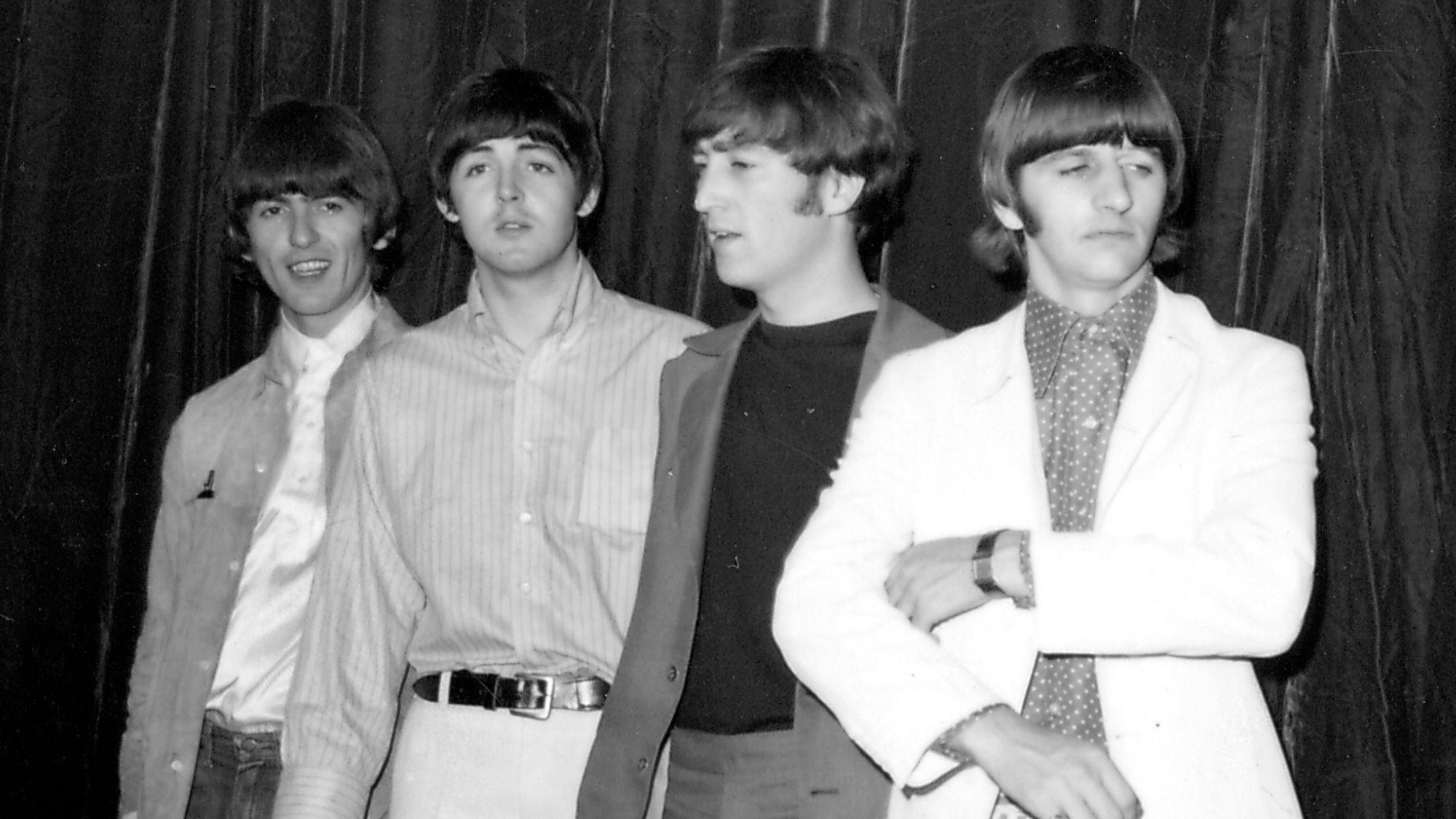
‘Rubber Soul’ by The Beatles
It’s only fitting that The Beatles’ first “pot album” would have a trippy album cover, and Rubber Soul certainly did. Photographer Robert Freeman was projecting potential cover photos onto an LP-sized piece of cardboard when the square slipped, elongating The Beatles’ faces. Eager to ditch their teeny bopper, clean-cut image, The Beatles opted to stretch the photograph for the final cover, signaling their transition from puppy love to full-blown psychedelia.
‘Part One’ by The West Coast Pop Art Experimental Band
The West Coast Pop Art Experimental Band’s 1967 release, Part One, features a distinct and vibrant album cover that reveals more the longer you stare at it. What first appears like watery shadows eventually turns into the bridge of a nose, then a pair of eyes staring back at you. It was appropriately artsy and evocative of the times, coming out just months before the Summer of Love would kick off on the West Coast.
Photo by Keystone-France/Gamma-Keystone via Getty Images

Leave a Reply
Only members can comment. Become a member. Already a member? Log in.