Pink Floyd’s The Dark Side of the Moon album cover dots record store windows worldwide. It’s also plastered on thousands of college students’ dorm room walls, and even tattooed on fans’ bodies. The rainbow streak through a clear prism connects us all and is agreed to be one of the most recognizable album covers to date.
But from where did this prism piece come to exist? How did it become one of the most discernible album covers, even to those who are not fans? Let’s find out.
Videos by American Songwriter
The Man Behind The Dark Side of the Moon
On their eighth studio album and on the verge of breaking into the mainstream scene, Pink Floyd recruited Storm Thorgerson, in collaboration with Aubrey Powell, from the design group Hipgnosis to create their album art.
In an interview with Rolling Stone, Thorgerson mentions that he was in the studio listening to some of the album. He never said “anything, really, about the music. I just let it go over, really, I suppose. It’s my job to reinterpret it, really. So it doesn’t really matter what I think, it matters what comes out the other end.” What came out of the end was a prism, a rainbow, and many more album covers for Thorgerson.
Numerous of Thorgerson’s designs parallel surrealists like Salvador Dalí. He placed objects out of their traditional medium giving them a spacey and uncanny appearance. As for Pink Floyd, though, the band asked for something other than his usual funny pictures. So, despite never working on graphic designs before, he got to work. The first idea he had, taking a photograph that mimicked Marvel’s Silver Surfer, was dismissed by the band.
Thorgerson then decided to hone in on Pink Floyd’s light show as inspiration. He enacted the image of a triangle as a symbol of thought and ambition. These themes were prominent in the lyricism of the album. The image of the prism became a staple to the Pink Floyd fanbase.
“They hadn’t really celebrated their light show,” he told the outlet. “That was one thing. The other thing was the triangle. I think the triangle, which is a symbol of thought and ambition, was very much a subject of Roger’s lyrics. So the triangle was a very useful – as we know, obviously – was a very useful icon to deploy and making it into the prism – you know, the prism belonged to the Floyd.”
What Else Did Storm Thorgerson Create?
You may recognize other Storm Thorgerson designs. He worked on other Pink Floyd album art and for artists like Led Zeppelin, AC/DC, Peter Gabriel, The Cranberries, and Muse. From modern indie rock bands like The Wombats to jam bands like Phish and Umphrey’s McGee, Storm Thorgerson has done ninety-three album arts alone not including his work with the Hipgnosis group.
In the early 1990s, Thorgerson founded StormStudios—a design company for art direction and photography. He passed away in 2013.
More Behind the Album
-

1969: Rock band "Blind Faith" pose for a portrait in 1969. (L-R): Steve Winwood, Ric Grech, Ginger Baker, Eric Clapton. Photo by Bob Seidemann. (Photo by Michael Ochs Archives/Getty Images) -

George Harrison with wife Patti Boyd arrive at the premiere of Yellow Submarine film, London Pavilion, 17 July 1968. (Photo by Mirrorpix via Getty Images) -
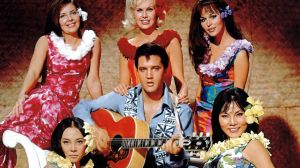
Elvis Presley in a publicity pose from 'Paradise Hawaiian Style' with Suzanna Leigh, Mariana Hill and Irene Tsu 1966. (Photo by Screen Archives/Getty Images) -

Elton John converses with his songwriter partner Bernie Taupin at his Studio 54 party. -

LONDON – 1967: The members of the English supergroup Cream, (from left) English guitarist, singer, and songwriter Eric Clapton, Scottish bass player, singer and songwriter Jack Bruce (1943-2014) and English drummer Ginger Baker (1939-2019), in London, 1967. (Photo by Icon and Image/Getty Images) -

LONDON, ENGLAND – DECEMBER 18: (EDITORIAL USE ONLY) Sir Paul McCartney performs at The O2 Arena during his 'Got Back' world tour on December 18, 2024 in London, England. (Photo by Jim Dyson/Getty Images) -

UNITED STATES – JUNE 01: Photo of Jimmy PAGE and Robert PLANT and LED ZEPPELIN; L-R. Robert Plant, Jimmy Page performing live onstage (Photo by Robert Knight Archive/Redferns) -

Lindsey Buckingham from the rock group Fleetwood Mac. (Photo by Robin Platzer/Getty Images)