Stanley Donwood, born Dan Rickwood, met Thom Yorke, a fellow art student at Exeter University. Donwood described Yorke to Far Out Magazine as “Mouthy, pissed off, someone I could work with.” His “mouthy” friend played in a band called On a Friday. They’d eventually sign a record deal and change their name—at the label’s request—to Radiohead, a name adopted from a Talking Heads song called “Radio Head.”
Following the global success of “Creep” from their debut album Pablo Honey, York invited Donwood to design cover art for Radiohead’s EP, My Iron Lung (1994). Donwood accepted because he knew and liked Yorke, though he didn’t enjoy rock music and wasn’t a fan of the band. The new partnership blossomed over Radiohead’s career as they became one of the world’s biggest and most inventive rock bands. Donwood’s creative collaboration with Yorke has produced iconic images as recognizable as the music.
Videos by American Songwriter
The visibility of his work led to an event in 2021 where six paintings made for Radiohead’s 2000 album Kid A were auctioned at Christie’s in London with Yorke’s co-curated drawings, letters, and digital art. Donwood’s Radiohead art has been featured in galleries around the world.
His work continued with York’s projects outside Radiohead, including his debut solo album, The Eraser. The prints used to create the cover art for The Eraser first appeared in an exhibition called “London Views.” Donwood also designs art for The Smile, a band featuring Yorke, jazz drummer Tom Skinner, and Radiohead guitarist Jonny Greenwood.
Donwood is sure to avoid cross-pollination between Radiohead-related projects. Each creation, like each record, has its own identity. His artwork endures like Radiohead’s music in sometimes terrifying ways. Yorke’s dystopian outlook of fast-moving technology in the late ’90s seems prescient against social media’s role in spreading conspiracy theories that fracture society and threaten Western democracies.
Process, narrative, and aesthetic drive Donwood’s work. If there’s one word to describe his art, it might be “uneasy.”
5. The Bends (1995)
Radiohead’s second album, The Bends, was Donwood’s first full-length album cover. Thom Yorke asked him, “Do you want to have a go at doing the record sleeve?” Donwood, who was poor and juggling odd jobs, said yes. He found a CPR dummy and filmed it with an old video camera that captured the image onto a cassette. The Bends continued the group’s ascent, and Donwood has designed every Radiohead album cover since.
4. Amnesiac (2001)
For Amnesiac, Donwood thought of discovering an old book buried deep inside the attic of a decaying, abandoned house. A crying minotaur appears on the book jacket, representing a monster weeping because it doesn’t know how to be a monster. He described Kid A as a “f—ed up phone call,” while Amnesiac felt like a long voice message. A hardback book accompanied the limited edition version of Amnesiac. He and Yorke won a Grammy Award for Amnesiac’s design.
3. Hail to the Thief (2003)
Donwood creates the art for Radiohead while they record. The two art forms happen side by side, and Yorke has difficulty settling into a project before the visuals take shape. For Donwood, music inspires the direction of the band’s art; one can’t happen without the other. Radiohead and Donwood made Hail to the Thief in Los Angeles. While riding in cars, Donwood noticed multitudes of signs in America. He came across a lawn sign that read: Armed Response. Donwood was struck by the easy violence replacing Get Off My Lawn. The album jacket for Hail to the Thief represents American paranoia and the ongoing war on terror. The artwork maps the cities of London, New York, Los Angeles, Grozny, and Kabul.
2. OK Computer (1997)
Donwood and Yorke wanted a “bleached bone” color scheme for OK Computer. Keeping with the album’s themes of technology and transport, Donwood created the album cover on a computer with a light pen and tablet. He and Yorke set a rule that they couldn’t erase anything. They collaged images, and Yorke wanted the artwork to act as a visual diary for the album’s recording sessions. The stick figures in the liner notes represent exploitation. One figure is being sold something they don’t want, while the other is acting friendly because they are trying to sell something. OK Computer is the sound of Radiohead while the world buzzes noisily by.
1. Kid A (2000)
On Kid A, Radiohead reimagined what it meant to be a rock band. Musically, their most ambitious and experimental work became their first U.S. number-one album. The artwork was equally ambitious. Donwood painted onto huge canvasses with knives and sticks. He’d then photograph the canvasses and manipulate them in Photoshop. The mountains are landscapes of power, like pyramids. It represents ruinous power as a part of nature. “Kid A” is a placeholder when a child doesn’t have a name, and this album forever changed Radiohead’s identity.
Photo by Theo Wargo/WireImage
More Features
-
American singer Donny Osmond of singing group the Osmonds at the Churchill Hotel in London, 29th October 1972. (Photo by Len Trievnor/Express/Hulton Archive/Getty Images) -
British pop singer David Bowie pictured at the Dorchester Hotel, London. 20th October 1977. -
Gregg Allman of the Allman Brothers Band -
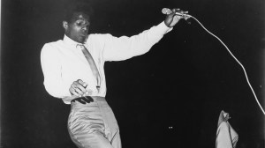
Bobby Freeman performs on stage in 1964 in the United States. (Photo by Gilles Petard/Redferns) -
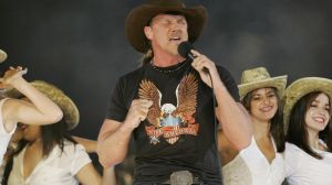
MIAMI – JANUARY 4: Country singer Trace Adkins performs at halftime during the FedEx Orange Bowl 2005 National Championship game between Oklahoma and USC on January 4, 2005 at Pro Player Stadium in Miami, Florida. (Photo by Brian Bahr/Getty Images) -
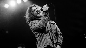
CHICAGO, IL – MARCH 7: Singer Eddie Vedder of Pearl Jam performs at the Chicago Stadium on March 7, 1994 in Chicago, Illinois. (Photo by Paul Natkin/Wire Image) -
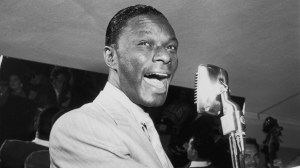
19th July 1951: American pop singer and pianist Nat 'King' Cole (1919 – 1965) plays piano and sings into a microphone. An unidentified bassist plays behind him. (Photo by Hulton Archive/Getty Images)