Your cart is currently empty!
The Story Behind the Rolling Stones’ Famous Tongue and Lips Logo
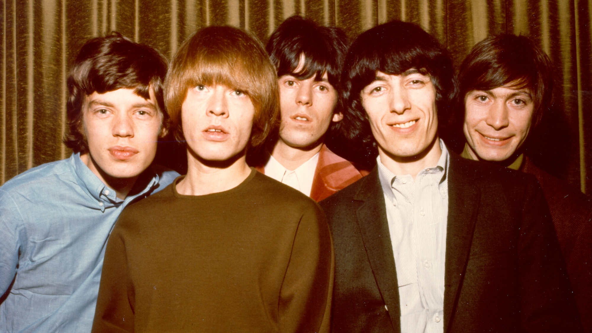
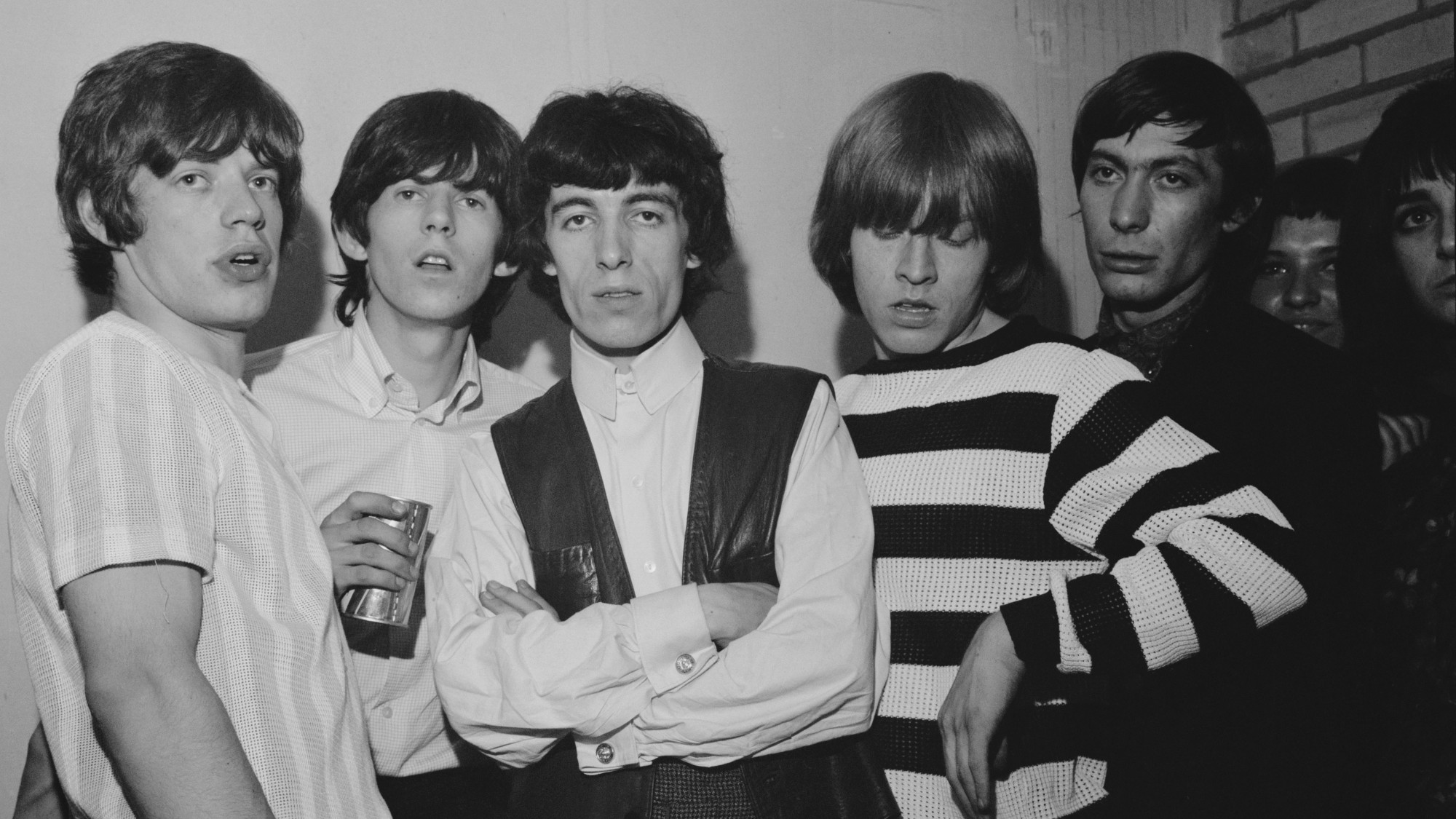
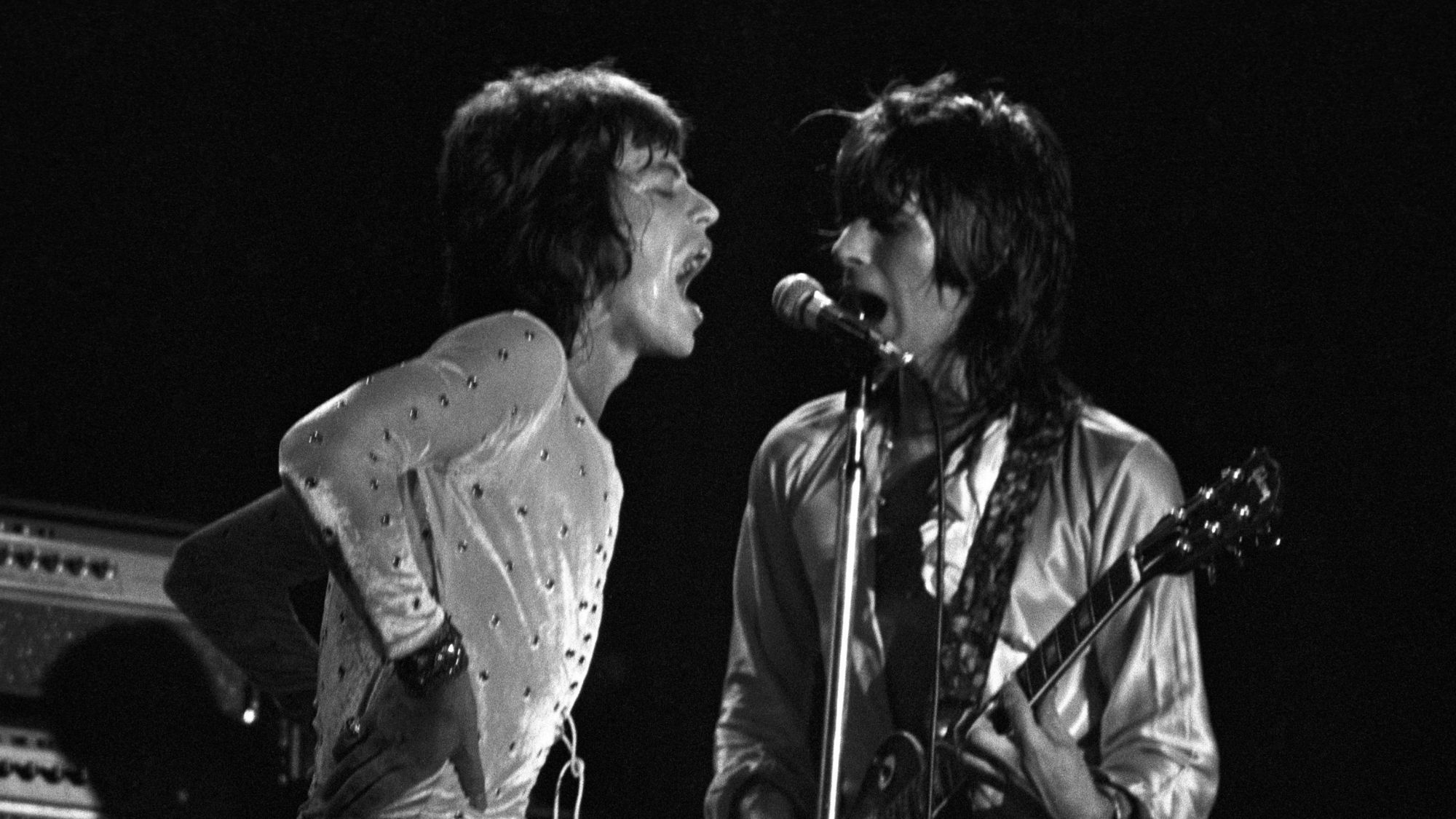
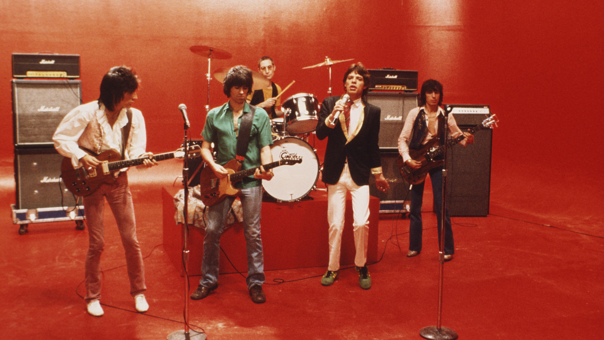
The Rolling Stones have one of the most iconic careers and infamous band logos of all time. You can spot it a mile away with its cherry red lips and tongue just peeking through the teeth of the logo. The logo recently celebrated its 50th birthday in 2020 while the band recently marked its 60th year of music.
Videos by American Songwriter
The “tongue and lips,” also known as the Hot Lips logo, transcended music beyond people who are just fans of the Stones. It is now a staple printed on everything from mugs to t-shirts, so people who aren’t even fans can enjoy it.
But where did the logo come from? Why did the Rolling Stones decide on this particular one?
Jon Pasche Meets the Rolling Stones
The head office of the Rolling Stones contacted the Royal College of Art in London to inquire about hiring someone to create a poster for their 1970 European tour. The school recommended John Pasche, a master’s student. Pasche met with Mick Jagger, offering up some designs, but Jagger wasn’t satisfied. Thankfully, a second version of the poster sealed the deal between Pasche and the Rolling Stones. Pasche created a poster with a ’30s and ’40s aesthetic with a Concorde turbojet.
Later that year, Pasche was contacted again by the Stones. This time by Jo Bergman, the band’s personal assistant. Bergman wanted Pasche “to create a logo or symbol which may be used on note paper, as a program cover and as a cover for the press book.”
“Just an Art Student” Making More Than “Just a Logo”
Pasche and Jagger met again to discuss the logo. Pasche recalled that Jagger wanted “an image that could work on its own … like the Shell Petroleum logo. He wanted that kind of simplicity.” In the meeting, Jagger showed Pasche an illustration of the Hindu deity Kali, which Jagger saw at a shop near his home.
Pasche recalled that Jagger was more interested in the Indian cultural side of it as it was trending in Britain. But, Pasche was struck by its protruding tongue from the diety’s mouth. Contrary to belief, the tongue and lips aren’t Jagger’s.
The first proof of the logo was in black and white, and Pasche wanted the logo to be a symbol of protest. “It’s the kind of thing kids do when they stick their tongue out at you. That was the main reason I thought it would work well,” he remarked.
Over 50 Years of Influence
Even today, the logo generated the Stones an insane amount of money. People estimate that the logo brought in hundreds of millions of pounds. Pasche was paid £50, which is around $970 today. He was also given a £200 bonus.
In 1976, Pasche drew up a contract to receive 10 percent of net income sales from the work. He made a few thousand pounds from the royalties, but in 1982, he sold his copyright to the band for £26,000.




Leave a Reply
Only members can comment. Become a member. Already a member? Log in.